Collaborative Design Practice: Task 4
-7135075.jpg) 31/10/2023 - 17/11/2023 (Week 11 - Week 12)
31/10/2023 - 17/11/2023 (Week 11 - Week 12)Evaleez Voo Lian Yun / 0350275
Collaborative Design Practice/ Bachelor of Design (Hons) in Creative Media
Task 4
Research
After looking at photos from Innofes, we noticed that the SOMAC students used a white background behind the logo, instead of making it transparent. Whether it was purposely done or not, we decided that in order to make the art direction more consistent, GEM needed a brand guideline on how to use their logo. Hence, I took up that job and researched on how to create a brand guideline.
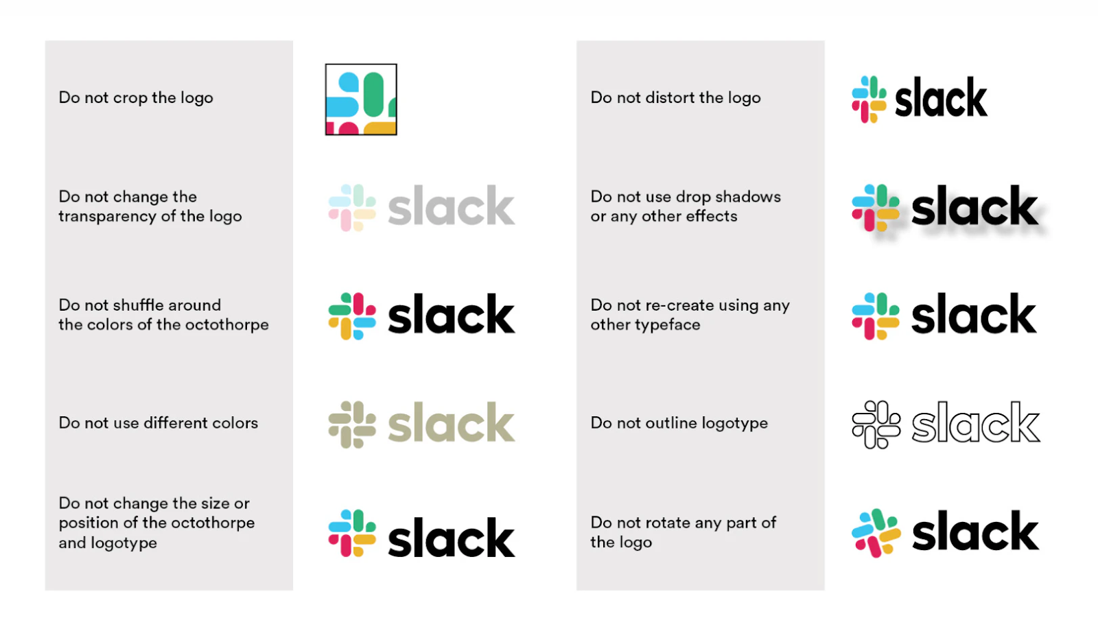 |
| Fig 1.0 Slack Brand Guideline |
I found an article on Oberlo, which sshowcases examples of great brand guidelines made by current companies. The on I referenced the most was from Slack, as it is designed to be informative without overwhelming the readers. Slack simplifies the concept of its brand by displaying improper use situations, so users can easily identify what to do and what not to do.
 |
| Fig 1.1 Slack Brand Colours |
Task
Week 10
This week we presented our slides to our module mates. We worked together on the slides the Sunday before to ensure that everything is finalised and ready to go. Moreover, we also separated our parts for the presentation.
Presentation Slides:
That week, I didn't have time to visit the exhibition, but our group mates did. Here, they took some pictures on what the booth looks like:
 |
| Fig 1.2 GEM Booth |
 |
| Fig 1.3 GEM Booth |
Week 11
This week I missed the feedback session because I thought the timing was still at 10am. Nonetheless, my groupmates seeked advice from our lecturer on how to make it more playful, as per client's request. Based on the summary they told me, we need to utilise our secondary colours more, i.e. the orange and yellow colours.

As mentioned before, we noticed that there was no brand guideline on how to use the GEM logo, so I started working on it. I added the basic "do nots" and also how to utilise the logo with the background colours.
Brand Guideline:
Week 12
This week, my team finalised all our deliverables. Jo Min did great work on the animation and the website from our UI/UX students were also done well. It definitely feels more energetic than before. For the packaging, Cecil and Vernice did the final refinements as well.
After compiling everything, we decided to submit the files to our Google Drive.
Submission
Packaging Mockup:
Website:
Animation:
Presentation Slides:
Feedback
Week 10
- Our group has been very consistent and organized from the start. We take feedback really well.
- Promotional video and the 3D models are great, probably the best deliverable we have now.
- The packaging needs to be described better, aka how to use, what it would look like.
- From TBS: All things actually are in our expectation and we are satisfied with the final outcome. But we think that maybe some design part can be more playful and creative that will catch people’s attention. For the video, it was really great 👍🏻 And for the packaging, the final prototype actually exceed our expectations and during innofest got someone made compliment with our packaging.
Week 11
- Use the orange and yellow colours in our palette more. They can help create the playfulness aspect of the brand.
- Stick to what we have but try to make it more light hearted.
Reflection
Experience
For me, since I have never made a brand guideline before, taking up the job to create one was definitely an experience. Thankfully, there were a lot of websites that teach this. Moreover, I referenced the work donw by the other groups after seeing their slides on Week 10.
Observation
I observed that if a designer works too long on a project, they won't be able to see the minor details that much. For example, when we were listening to the presentation by Oatlicious, I noticed that some of their lineart does not have the same thickness, thus making their outputs inconsistent. Ms Lilian noted that this might occur, hence a second opinion is important.
Findings
Throughout this project, I found that having a strong art direction and brand identity can make or break the company. For my group, it took us a while to create a logo that best represented the brand, and I believe that has hindered us quite a bit at the start. After seeing the work from Kita Keto, it became more evident that a strong brand identity can make the process of creating deliverables easier and faster.
-7130499.jpg)
-7130470.jpg)
Comments
Post a Comment